- Website Design
- Graphic Design
- Graphic Design Services
- Advisory
- ตลาดออนไลน์
- Website Marketing
- Social Networks
- Advisory
- IDM Brands
- Online Jewelry
- Interior Design
- Medical Tourism
- Case Studies
- Contact
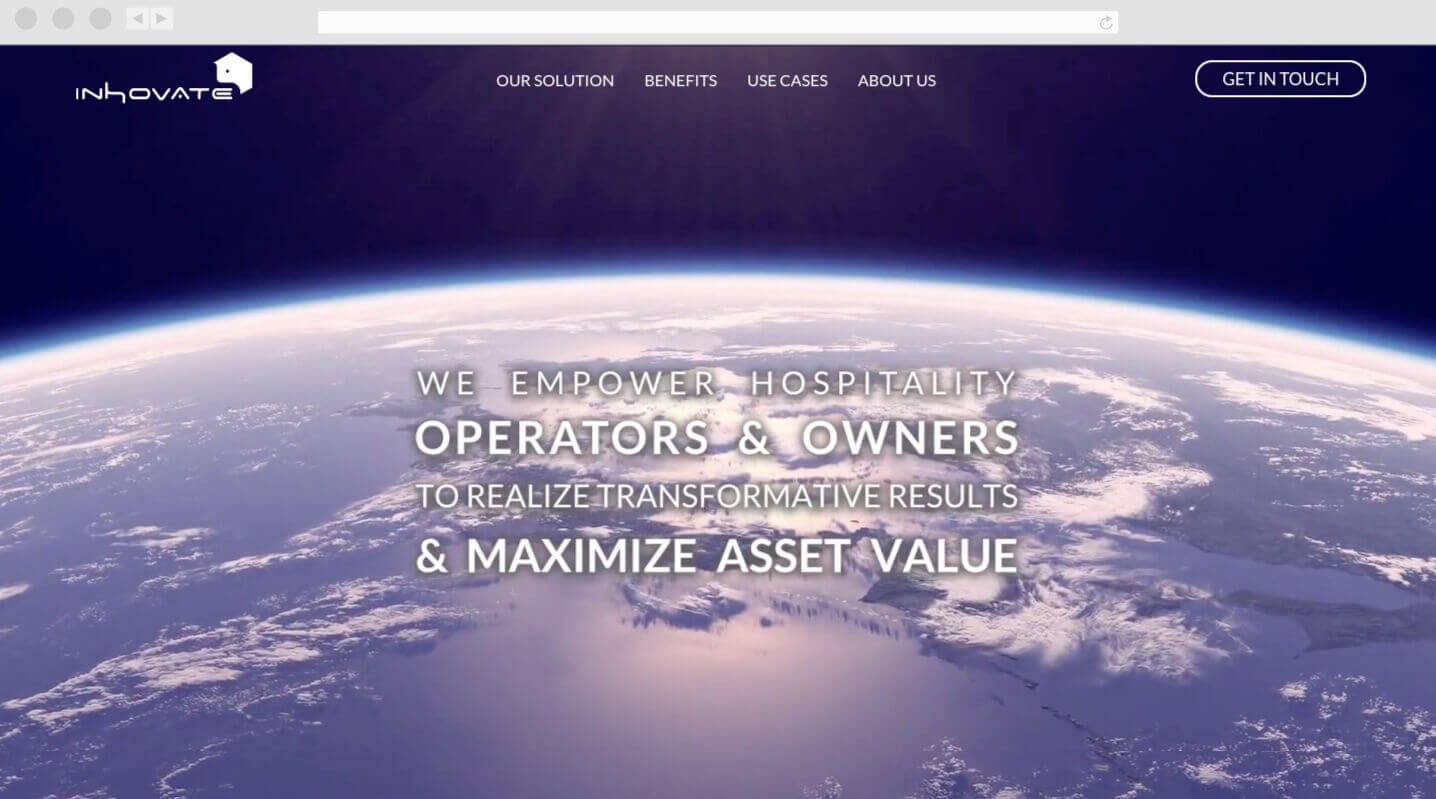
inhovate.com
inHovate selected us to create their website after seeing our work on a tech start-up called Assurity.
Assurity’s branding is space-themed and that served as a major factor in their decision to go forward with us.
Working with inHovate’s team was a unique experience for us. It’s rare and slightly taxing to work with a client who wants to be heavily involved in the creation process. When the project began their CCO gave a detailed presentation of their vision for the homepage with every section mapped out based on what it needed to achieve.
They told us the design needed to be “80% tech and 20% human”.
The designer in charge of the project encountered a lot of resistance trying to put “20% human” into a design concept because of the term’s inherent subjectivity, but with a continued back-and-forth with both teams our different visions became aligned.
Below are samples from the presentation they gave at our office.
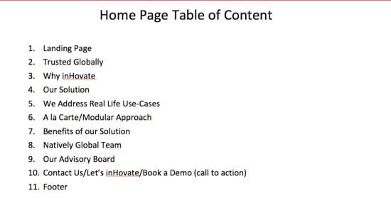
Initial section order for the homepage.
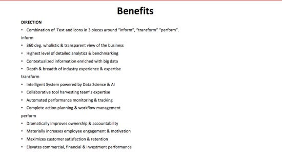
Direction for a chart listing benefits the software provides.
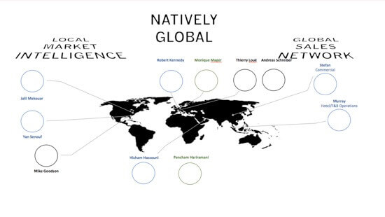
It was very important to have a section showing the how widespread the team is globally.
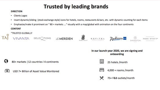
Direction for highlighting well known hotel operators willing to adopt the software.
Hexagonal icons were created to pair with the company’s logo. They’re designed to look alien and mystical to keep in line with the concepts of being futuristic, advanced and edgy.
Many encircling frames were used to give a sense of pulsating energy.
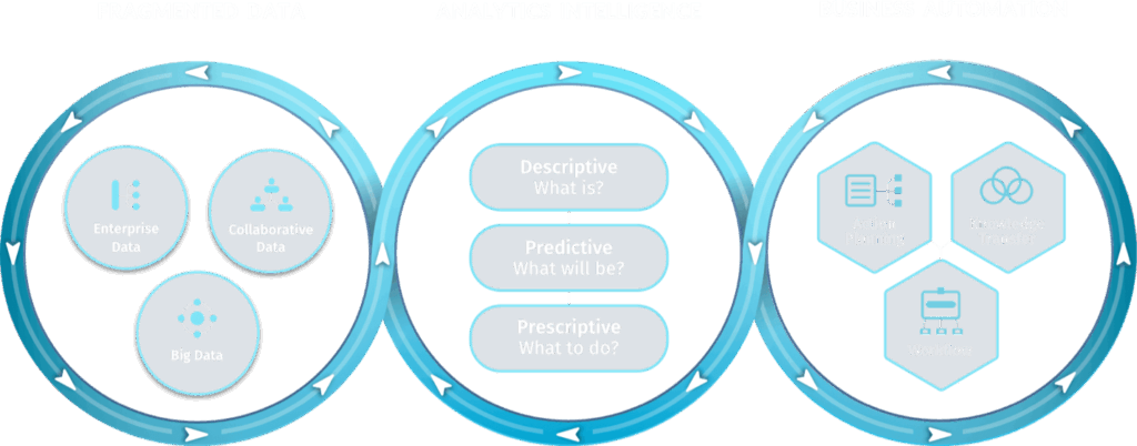
A challenging hurdle in the project was designing an infographic that could properly represent how the software analyzes data, redistributes data, and prescribes action cross-functionally.
Pictured below, is the original satellite-inspired graphic used for internal discussions.
It didn’t do a very good job of showing movement, at a glance one would assume whatever action the graphic was trying to convey was being sent outward from the hexagonal center.

Our initial redesign didn’t solve the movement issue. In fact, looking back at the first try at the design it became difficult not to unsee an airplane propeller. The infographic below was also designed when the brand’s color palette was broader.

We ended up delaying the creation of this graphic so we could focus on creating the rest of the website.
Distance helped and we returned with the final ‘helix mobius strip’ concept seen below.
It was the perfect and only choice to resolve this design challenge.
There could be no doubt in anyone’s mind that this graphic showed movement around three different cores. Regardless of one’s knowledge on tech, a user would take away that the inHovate solution provided and interconnected environment.
Hover effects and animation were used to fit large amounts of information into sections without making them too tall. It also served as way to prevent information overload for visitors that are trying to get a basic hold on the software.
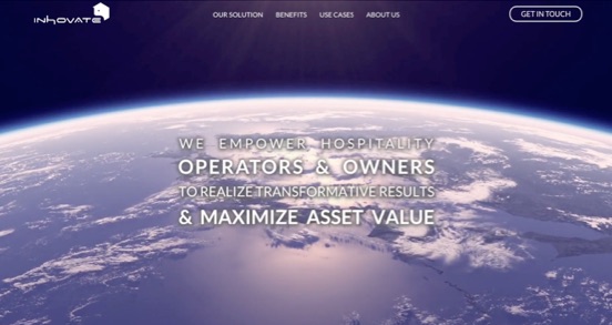
Hero video states the purpose of the application and frames it as a new beginning
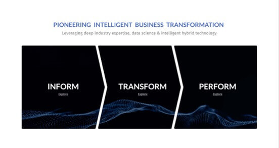
Hover-cards reveal details of what the solution enables

Hover-cards for team and advisory board bios
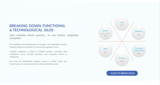
Button to break down walls between functional silos